As part of our ongoing efforts to enrich and diversify the curation of critical games writing, Critical Distance is proud to present this new Spotlight feature bringing together a selection of top-tier level design analyses by guest contributor Hamish Todd.
Level designers are the people who take the objects of a game engine and arrange them to create activities for players. They might arrange them by hand, or design/program some procedure that generates semi-random arrangements. A game engine is an instrument that the music level design is played on. The level designer decides what choices and propositions the players will see. So the job is pretty damned important; in some genres (puzzlers, stealth games, platformers) it seems to me that it is the job with the most importance.
Despite this, longform analyses of level design are relatively uncommon. But these sorts of articles are valuable for us for a number of reasons:
- If we have any suspicion that artistic expression in videogames might be to do with setting up interesting decisions for players within a consistent game engine, then level design is crucial.
- Level design is a difficult discipline, and new designers shouldn’t have to “make things up as they go along”. The critical community can provide developers with advice and recommendations for role models.
- A lack of discourse also means that critics lack a framework that allows them to articulate or even understand their own feelings about interactive entertainment. Why, for example, is playing Halo: Combat Evolved so much more interesting than playing Crysis? Why do people enjoy Mario games so much? Why is it that after a long and at-the-time enjoyable session of playing Peggle, you have the nagging feeling that someone just scammed you? Many writers try to address questions like these solely on abstract, narrative or pop-cultural levels. But analysis of gameplay is significantly more important.
This is why I am turning the spotlight upon the best writings on the internet that analyse level design.
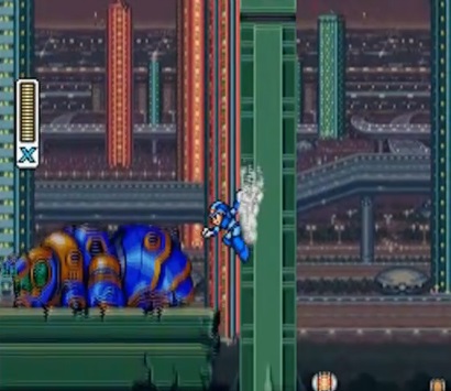
I’m going to start by linking to the most important level design analysis around: Arin “Egoraptor” Hansen’s look at Mega Man X (his other Sequelitis videos are good too). I say it is important because it has almost seven million views. When the teenagers who enjoyed it have grown up, you might see many more game analyses like it. And is it a good analysis? Well no, not really – the links below will take you to discourse that is much better, if a bit less entertaining. Mega Man X is more repetitive and less thematically clever than Egoraptor makes it out to be, and a player’s first experience with it is likely to be more chaotic than he makes out. That said, the way the game teaches wall jumping is indeed genius.
The best writing about intro stages, and the articles which really started this form of analysis, were anna anthropy’s level design lessons. There’s a lot of them in that link! In my opinion, the best ones are this one about Catacomb Abyss that introduces the idea of “teaching through accident”, and this one about a thoughtfully-planned puzzle from Super Mario Bros.
One thing that emerges as a theme in anna’s SMB article and others is an awareness of the multiple ways a part of a game can be played. I don’t mean Deus Ex- or RPG-style “choices”. I mean in the more capricious sense of “is there some situation whereby the player won’t encounter possibility X, and will instead just experience Y again?”. This is what you will come to understand the importance if you ever see one of your favorite games played by an unskilled player – something worth doing if you want to write an articles like these.
A good awareness of that capriciousness is shown in this forum post about Sonic. There’s also good forum work by user “Glass Knuckle” in this Talking Time thread, which surely influenced Egoraptor’s Mega Man video.
Next I’m going to link to a few of my own writings.
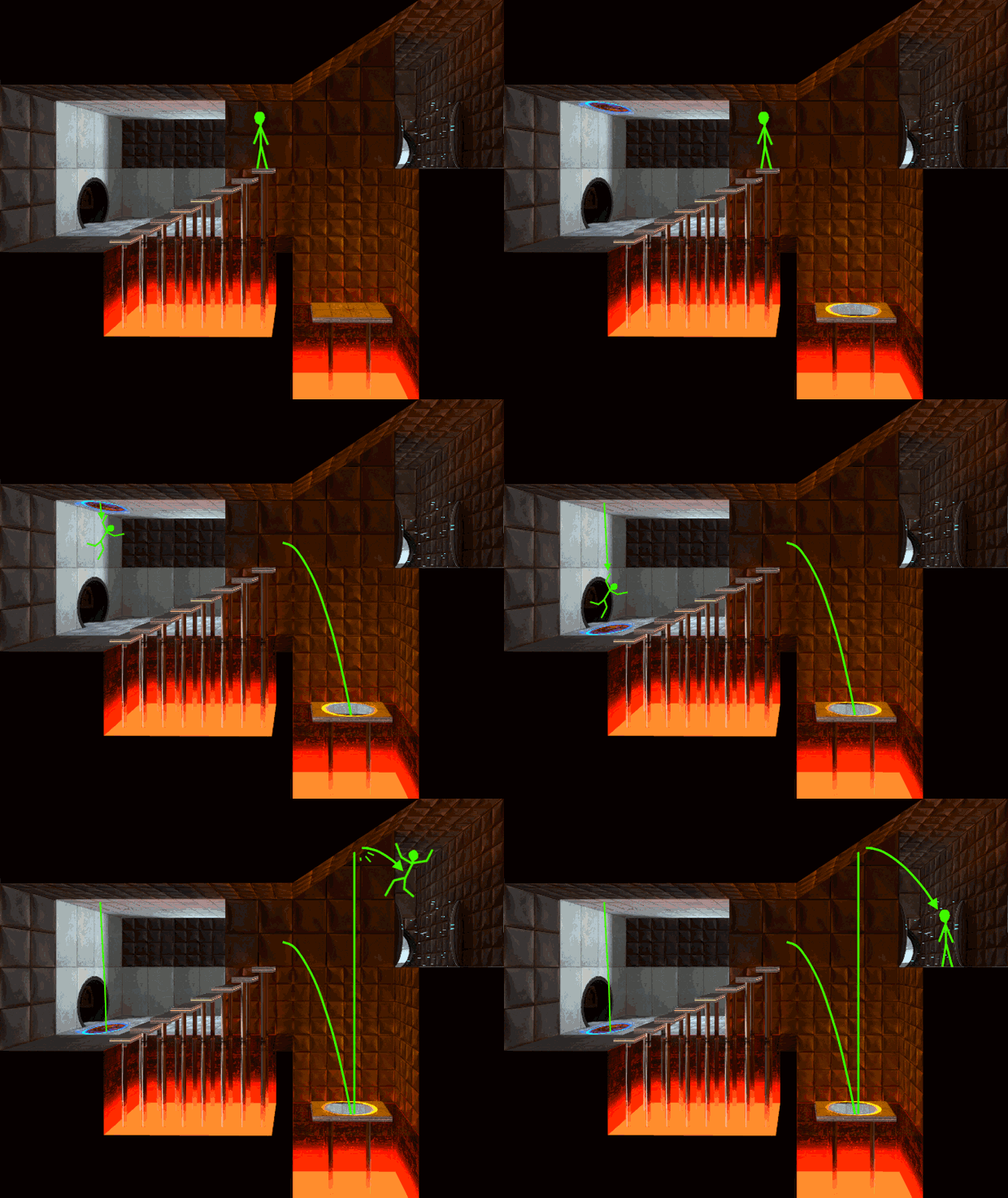
This article about Portal is my finest work. Portal is the perfect subject matter, with expressive and perceptive design, and I took the time to create animated diagrams of the levels too. I’m also proud of this gamasutra article looking at a collection of platforming setpieces in the original Tomb Raider. In general, TR has boring level design, but I was determined to flush out everything I could. With this Half Life article I had to settle for bad pictures, but it has good insights and a lot of work in it (trying to get Destructoid to publish it was one of the most horrible experiences of my life. Editors, please treat your freelancers properly. And pay us.)
Mostly on my own, I’ve created a TVTropes article for the “antepiece”, the powerful and underappreciated level design teaching-technique I came across while looking at Half Life. Tvtropes is a completely awful as a source of information on design patterns, but it can be improved.
“Expressive level design” is the thing I’ve strained the importance of since I started out with this analysis on Kotaku of Castlevania’s “Medusa Heads”. I’m still happy with that analysis, except for my treatment of the “axe knights” setpiece, where I got infatuated with one player approach over all others. Last-and-also-least, there’s this article about a fight in Shadow of the Colossus. It has too many words and not enough pictures, but I said some interesting things.
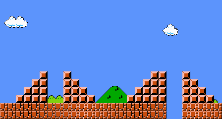
There is a slight cliche in this kind of analysis for talking about the opening scenes of Super Mario Bros. Of the various essays on that level I could link to, I’ll choose Jeremy Parish’s post on 1up, which also ties it together with the start of Super Mario Bros 3. There’s also some nice articles about SMB 3 on this blog. Parish, by the way, has a lot of level design analysis on his personal blog; one of my favorites is this look at the end level of the original Metroid. Super Metroid is another common target for level design analysis. The best dissection of it I’ve seen is here – although it’s not so rigorous or good, it’s just so comprehensive that it inevitably makes many notable observations (“Metroid fans only”, perhaps).
Everything I’m linking to here has a critical and analytical element. However, an unfortunately large amount of level design writing does nothing but describe levels, which is boring and pointless. It’s also complacent. The sad fact is that, even in many above-average games, the game design you encounter is at best incompetent, and at worst insidious. It makes me physically sick to watch this Extra Creditz analysis of Bejeweled; it’s like listening to a gun nut gush about how easily their rifle could end a person’s life. “Social” game developers have game design publications on the internet too, but I have no desire to link to those.
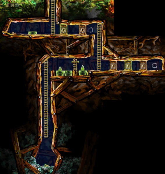
An example of a highly critical, highly informed article is Krystian Majewski looking at Braid’s puzzle design. Braid’s puzzles are some of the best the world has ever seen, and actually Krystian knows this, so you’re looking at a very thoughtful article here (although it’s a pity Krystian went with the convention of referring to the player as “he” when the gender-neutral “they” could have done as well). To understand those puzzles better, here’s Jonathan Blow’s developer talkthrough of Braid.
Lying halfway between “How to profit from fucking your audience’s brains up”-style writing and decent analysis is James Partridge’s talkthrough of Half-Life 2: Episode 2. I’ve timestamped that link because the first ten minutes aren’t so interesting. What I take away from that video is “Half Life is fun because you’re constantly doing stuff, and that stuff is often unmistakable busywork, but you’re thick so you gobble it up haha”.
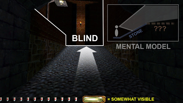
Continuing to look at good analysis of FPSs, the other best works I’ve seen are Robert Yang’s well-illustrated essay on a level in Thief, Simon Ferrari’s brilliant recent look at Left 4 Dead, and Liz Ryerson’s articles about Wolfenstein. Those articles take a holistic perspective, but it’s important to look closely at individual shoot-out arenas, so Steve Gaynor’s “comparison” of FEAR 1 and 2 is perhaps more worth reading. His next best article is about helpful level layouts. Of course, many first person games are really less about strategy and more about “environmental storytelling”, aka “walking around looking for shit”. This is the direction Steve went in with Gone Home – you can see him move towards that in his other blog entries, if you’re into that kind of thing.
One could argue that FPS encounters are so chaotic that thinking too hard about the initial states of objects in them is pointless. I believe that that is generally untrue, but I have to acknowledge that that does apply for beat-em-up encounters. Beat-em-up design analysis from a more appropriate perspective is, however, offered by Ben Ruiz’ wonderful blog.
A clarification before I go: I do not enjoy multiplayer games, though I know they can involve a lot of clever design. I touch my cap to them, but obviously I can’t feign authority about them! If there are articles about multiplayer games you enjoy, then I fully encourage you to post it in the comments. Also bear in mind that I haven’t quite seen everything and I am enormously biased, so please post as well if you feel I’ve omitted something good!
Hamish Todd is a science enthusiast and designer of Music of the Spheres, a recently released PC puzzle game about bouncing bullets, sound, and mathematics. He sometimes blogs at Gamasutra.com and is available for consulting.


